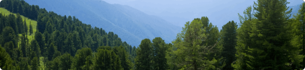
A concept project about protecting nature, centered on reforestation, river cleaning, and raising awareness. The website serves as a platform for uniting people who want to make a difference, while also promoting sustainable living through reusable products
BRAND IDENTITY
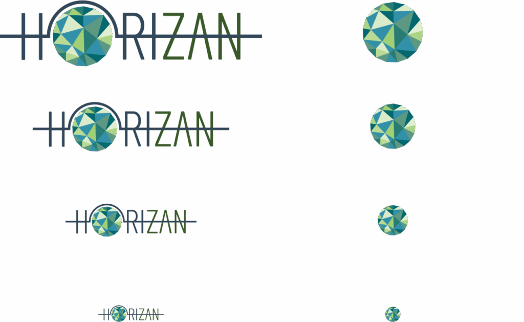
Earth is our common home, and the logo reflects this idea through its design.
Nature inspires us. The colors and shapes embedded in the logo connect us to it and remind us of the need to treat the world around us with respect and care.
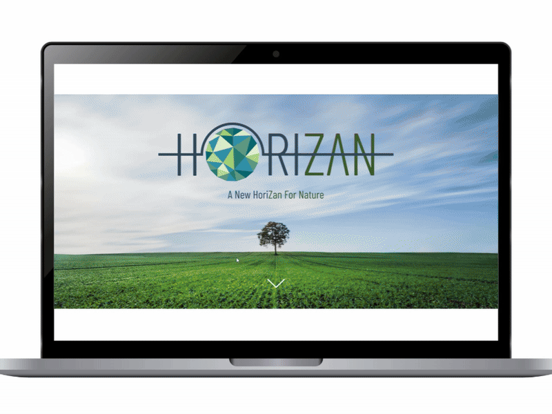
WEB DESIGN
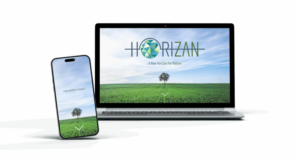
The website continues the brand’s visual language, echoing nature’s simplicity and minimalism, and creating a clear.
Nature inspires us. The colors and shapes embedded in the logo connect us to it and remind us of the need to treat the world around us with respect and care. The design is fully responsive, created for both desktop and mobile to ensure a seamless user experience across all devices.
Style Guide
TYPOGRAPHY
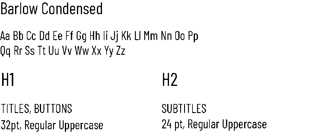
Barlow Condensed — modern, compact sans-serif with strong character, perfect for headlines, menus, and buttons.
Microsoft Yi Baiti — light and calm serif font, ideal for body text and long paragraphs.
environment and promoting sustainable living.
Pairing: Barlow Condensed draws attention to key elements, while Microsoft Yi Baiti keeps text readable and soft. Together they create a balanced hierarchy that matches the project’s minimalist and eco-friendly style.
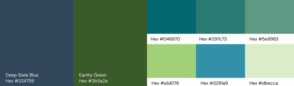
COLOR PALIETTE
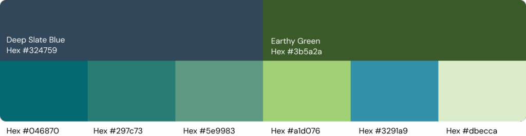
The color palette was taken directly from the logo, creating a seamless visual connection throughout the design. Using the same tones ensures consistency and harmony, reinforcing the brand’s identity and making the experience feel unified and authentic.
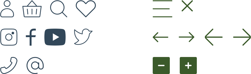
ICON SAMPLES
The icons were designed to be simple and intuitive, perfectly matching the minimalist style of the project. Their clean lines ensure clarity and usability.
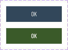
ELENENTS
Logo
Buttons
Other
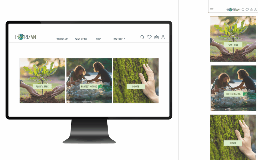
The website is divided into four main sections, organized by importance to guide the user naturally through the content.
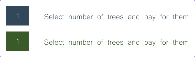
The first block >> is the most important: it connects people who are ready to take part in protecting the planet. This section sets the tone for the entire website, highlighting community and shared action as the starting point.
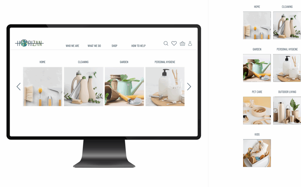
In the second block >> users discover reusable products presented by category. A minimalist layout with a carousel makes navigation straightforward and enjoyable.
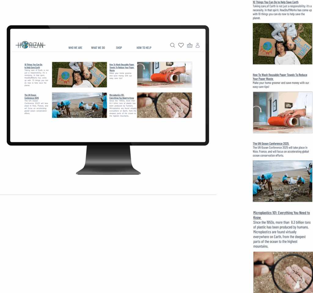
The third block >> is dedicated to global news about ecology and protecting the planet. It follows the same visual language and minimalist style, keeping the focus on content and awareness.
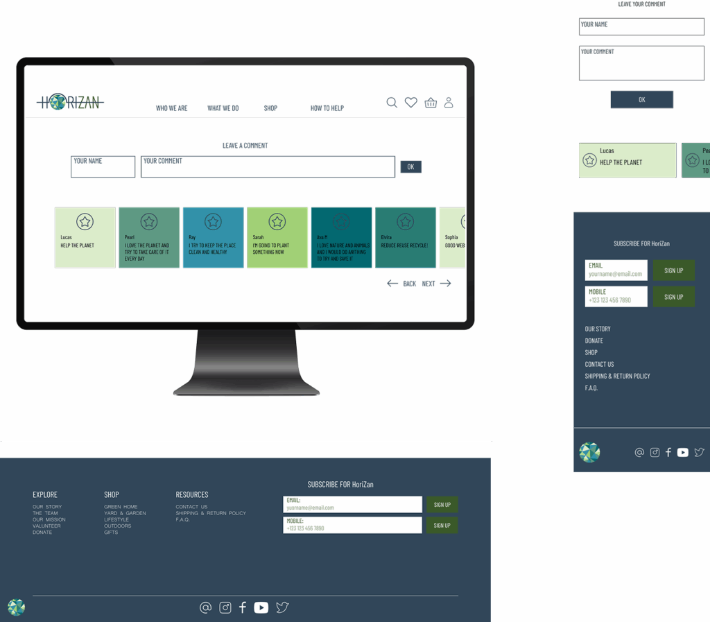
The final block >> is interactive, inviting users to leave their own note or wish — a symbolic way of taking part and feeling united. Each cell is filled with a color from the logo, reinforcing the brand’s identity and sense of connection.
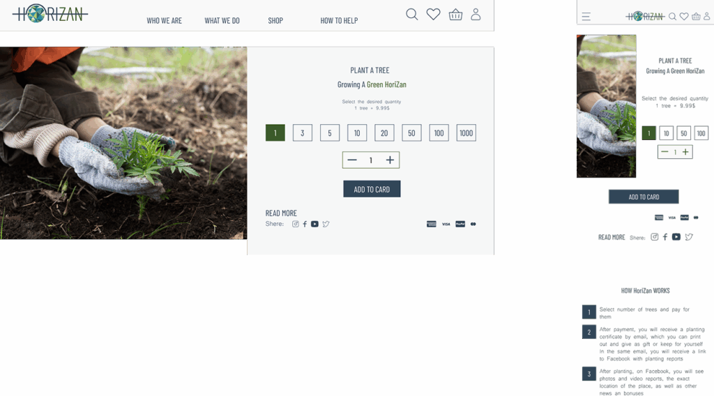
The product page >> is created in the same minimalist style, following the brand’s visual language. The design directs all attention to the product and its quantity, while secondary information is arranged with a clear hierarchy that supports the main focus.