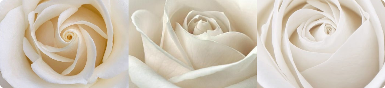
Just Candles are handcrafted rose-shaped candles. Each one is unique — combining elegance, simplicity, and beauty like a small piece of art.
LOGO
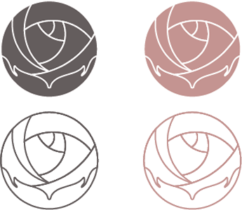
The logo reflects the essence of the brand through symbolism and form.
The logo is inspired by the repetition of natural beauty found in a rose. Within its form, hands appear as a gentle reminder of love, care, and soul. Smooth, delicate lines echo the flow of melting wax, giving the mark a sense of elegance, warmth, and authenticity.
The logo also follows the principle of the golden ratio, just as patterns in nature do. This harmony makes it more pleasing and comfortable to the eye, echoing the way we are used to experiencing beauty in the natural world.
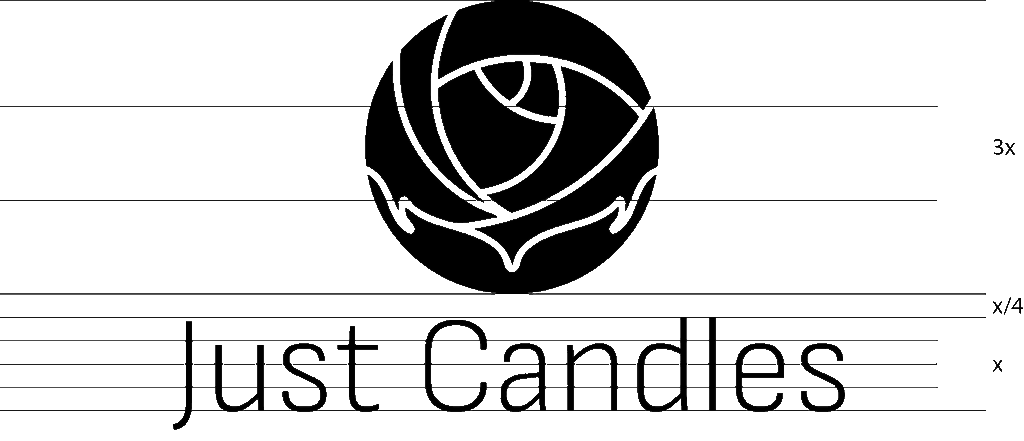
It is also important to keep the right proportions between the logo and the text. Their sizes and spacing were designed to create balance and a clear visual structure.
COLOR PALIETTE
The colors are soft and timeless, chosen to emphasize simplicity, harmony, and warmth.
Charcoal Rose Hex #645c5d
Dusty Rose Hex #c49491
TYPOGRAPHY
The chosen font, adds clarity and modern elegance to the brand.
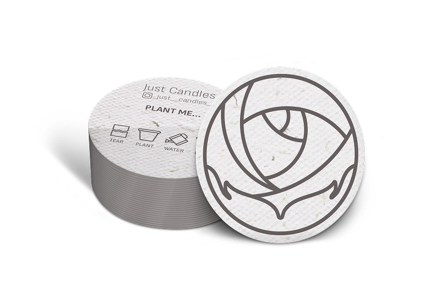
BUSINESS CARD
The chosen font, adds clarity and modern elegance to the brand.
Respect for nature lies at the heart of Just Candles, guiding every decision and detail. To protect ecology, we created a business card made from recycled paper, infused with wildflower seeds — so you can grow flowers right at home in the simplest way.”
How it works: 1. Tear the card into small pieces. 2. Plant them in soil. 3. Water regularly. 4. Wait a few days — and soon the first sprouts will appear.
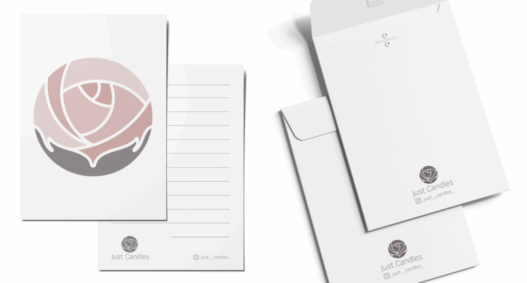
POSTCARD
Continuing the brand’s style, the card highlights elegance, clarity, and attention to detail.
The card is designed in a minimalist style, reflecting simplicity, elegance, and attention to detail. Created with care for the customer, it can be included as part of a gift — leaving space to write personal wishes and turning each candle into a thoughtful gesture.
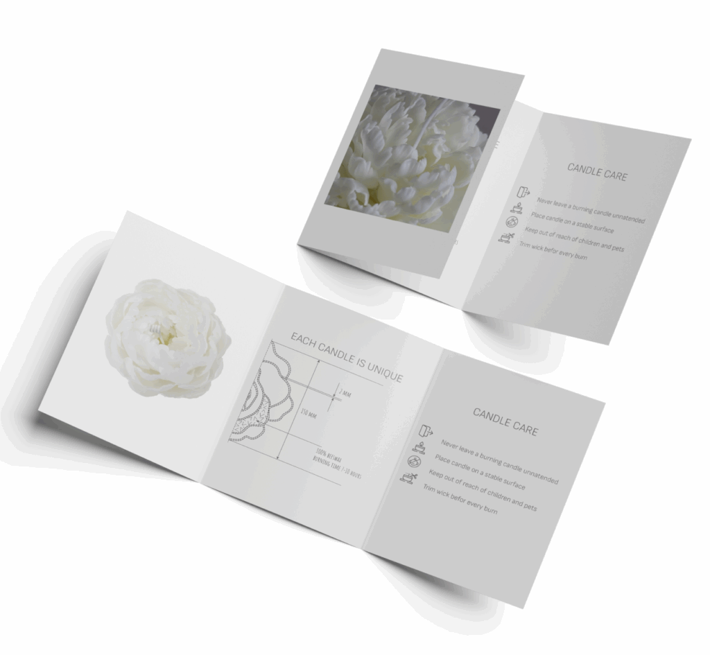
FLAYER
A flyer that shares the story of the product with style and clarity.
The flyer presents the product clearly and elegantly, highlighting candle care and uniqueness. It’s more than an informational handout — it can be placed in salons, boutiques, and spas, where it shares the brand’s message and adds a touch of refinement.
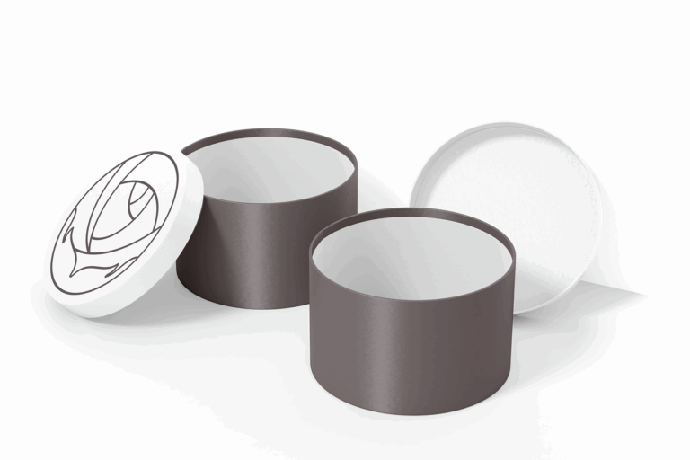
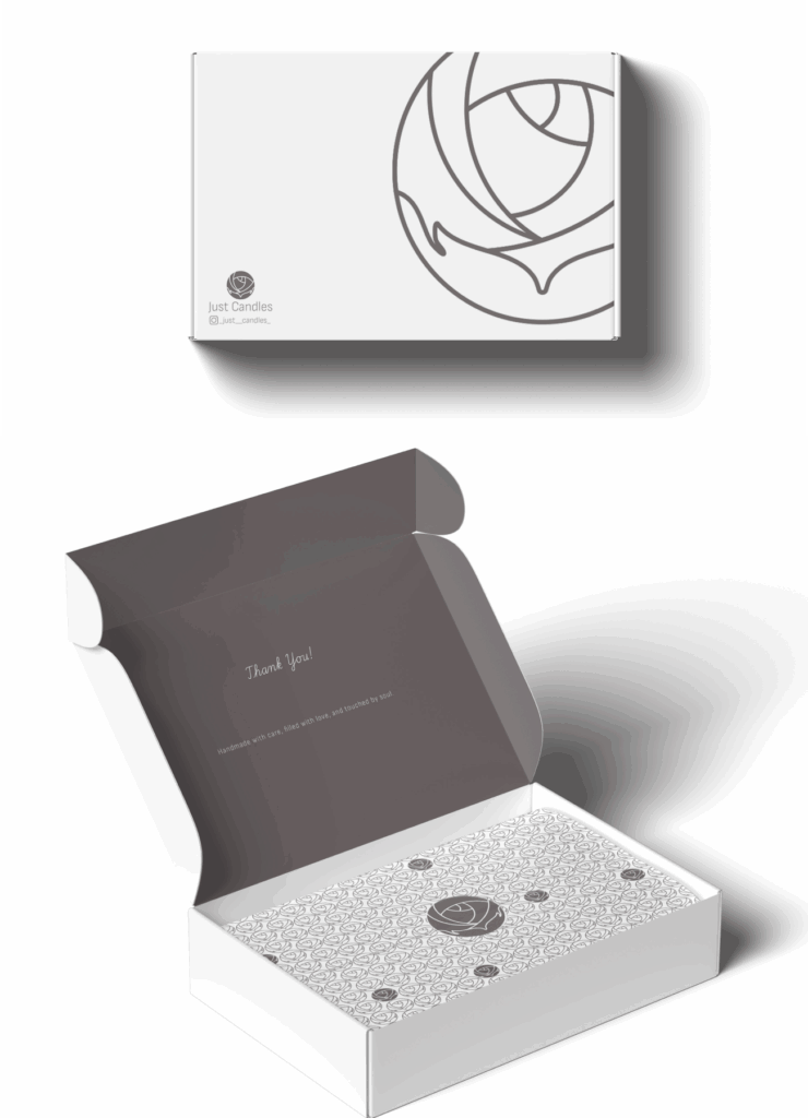
PACKAGING
Packaging made to be clear and convenient.
The packaging follows the brand’s clean and simple aesthetic, highlighting minimalism and ease of use. It is designed to work equally well for a single candle or a set of several, keeping the product safe while maintaining a refined look. Created with care for the customer, the packaging also features a subtle pattern that complements the design.